A blog about a student in college studying graphic design who loves to make traditional art as well
Wednesday, December 20, 2023
Spa Billboard Conceptualization
Monday, August 14, 2023
Website and poster for Alberta Forest Care
Information and Excerpts about the plight of Alberta’s forests:
Trees are mostly removed by using the logging technique known as clear-cutting. Clear-cutting involves using large machinery to remove enormous tracts of forest. This exposes the earth, which is therefore easily erodible. - Clear-cutting a forest alters the kinds of flora and animals that live there. - In the cleared regions, grasses and plants start to emerge. - Many of the forest's species must locate new habitats and food sources. The forestry firm occasionally replaces the trees it has removed but they never succeed in restoring the original ecology, despite their best attempts.
I
propose a different way. I recently scoped out the middle east side of the
province. I drove from Lloydminster to Vermillion Alberta. While on the road I
saw so much land prepared for cows to graze on. Someone told me that the
farmers had cut a lot of the forests that use to be there to make room for
these free roaming cows. I love that they have room to walk around in and eat
but these hilly lands were bigger than most of the small cities in this Alberta
region. I think the big and successful farming businesses should give 1/3 or ¼
of their land to build cities. The trees have already been cut and are nowhere
to be seen. We need to utilize these vast hills and give the customers and
consumers of these cow products that the farmers make money on by building them
a town, or a small city so they can live and buy even more stuff. The cows
don’t need 3 hills worth of grazing pastures. I feel like that is a little
excessive.
Saturday, August 5, 2023
The Poster I Made for The Werewolves of Miller's Hollow
The poster’s concept art highlights the two important key characters of the group game called “The Werewolves of Millers Hollow.” The pilgrims who close their eyes at night to sleep and the werewolves who open their eyes at night to kill. In the little village of Millers Hollow, where this portable party game is set, werewolves commit murders every night. Before the village loses its final few residents, it is now necessary to seize control and vanquish this ancient evil. The poster has a cheeky sense of trouble brewing in the air about it while the beautiful, blindfolded lady Abrill, gives the poster a sense of drama. Technically, the guy Juenzo isn't really a werewolf. The person with wolf characteristics is a friend of the redhead, and he's secretly supposed to be a werewolf since that's what the card he picked up states. The background is a photoshop stencil effect on a pilgrim town photograph. I like how it shows pilgrims gathered and running around town. It’s like an intriguing scene from a movie that makes you hope that the good guys in the game win. I find playing this card game to be very captivating, especially when the special roles are used. The Sheriff, The Hunter, the Witch, the Little Kid, The Fortune Teller. The Werewolves of Millers is a guessing game. Because no one knows who is who and everyone has knowledge to contribute and identities to hide at the same time, this people card game is incredibly intriguing.
The
game starts by the moderator introducing the scenario, which is a sleepy small
town, maybe in an alternate dimension. Late 16th-century Pilgrim area of the Southeast South Carolina region. The residents of the town are individuals who are focused on maintaining their farms and crops
on a daily basis. One afternoon, a bunch of schoolchildren head down to the
stream at the edge of town to go frog catching. The silence is abruptly broken
by a scream as the kids scramble up the hillside to their parents' arms for
protection. Words like "Terrifying!" and "Blood!" almost escape
their shaky mouths as they point trembling fingers at the willow trees along the
creek. When the grownups get at the creek, they see one evening guard reclining
against a willow tree. His body was ripped, with gashes everywhere. Is he alive? What can be capable of doing this? The word werewolf flows into their minds. The search for answers is on! To appease their fans, this
game has released several expansion packs after its initial 2001 release.
Sunday, July 9, 2023
Beaver Buzz Energy Drink Advertisement Poster
Who is it for? The 18th anniversary Beaver
Buzz energy drink poster is marketed towards snow athletes, but it is for anyone that
wants an extra buzz of motivation.
Why would they buy it? The snow berry flavor is mild,
different and sweet. Same great buzz of energy but with a new 18th anniversary
savor that tastes delicious.
What type of product is it? It is a Beaver Buzz
energy drink.
What is the key benefit of the product? It is a
canned drink that gives you energy when you drink it that is made with natural
ingredients.
How is it different from the competition? It is made
with more natural ingredients than other energy drinks. If you drink it your
energy buzz lasts longer, and it doesn’t make the body crash with exhaustions.
What is the product name? It is called Beaver Buzz energy drink.
To begin this assignment I had to build a picture collage that inspired winter sport energy into my creative brain. I also illustrated a cute kawaii, angry beaver cartoon that is supposed to resemble the Beaver Buzz energy drink logo. I ended up not really utilizing this drawing but I still like that I made it. Then I came up with a new flavor for the 18th anniversary flavor called "Snow Berry." Peace Teas already have that flavor but not Beaver Buzz. It's a very mild sweet berry like flavor. Then I gave my can a turquoise color because this company has not made an energy drink with a turquoise color yet. I also edited the original Beaver Buzz logo to fit the number 18 and photoshopped everything together. I then chose a nice picture of someone snowboarding and edited it to make it look impressive and cool. I love the dedication that snowboarders have to their sport. Practicing a trick or a jump over and over again till they master it. There is nothing like the feeling of flying in the air. Extreme snowboarders feel that for a moment when they are in the middle of a jump. I think that is so cool! I hope to one day learn how to snowboard. I also came up with the slogan "Feel the Iron Teeth Strong Buzz!" Beavers have Iron like teeth and snowboarders are strong in their own way. People who drink energy drinks want that strong surge of energy so I think the slogan conveys this.
To learn more about Beaver Buzz energy drinks and the company, please click this sentence.
![]() |
| I drew a cute version of their angry beaver |
![]() |
| At the bottom right is the cute beaver cartoon |
![]() |
| The picture collage |
Saturday, July 8, 2023
Starting to Learn how to build Advertisements
![]() |
| My first attempt at making an Ad |
![]() |
| The OG inspo and my rendition |
![]() |
| My Version |
Wednesday, February 1, 2023
Building a Board Game Instructions Manual
Tuesday, January 17, 2023
De Stijl art and Dadaism art merges
In 1916,
John Heartfield and George Grosz experimented with a form of art and combining
images created what is now recognized as Photomontage. John Heartfield crafted
highly political images that left a lasting impression with the Photomontage
technique. He was known for taking iconic images from the illustrated press -
like photos of well-known politicians or noteworthy events - and re-arranging
them to form new and provocative messages. John Heartfield and George Grosz
were pioneers of the German Dadaist movement, actively participating in the
renowned Berlin Club Dada (1916-1920). Through their trailblazing work, they
were instrumental in elevating the concept of montage to an art form that is
recognized worldwide today.
My
Creative Rationale: In
much the same way that the De Stijl artists did, I recognized the boundaries of
my poster space and filled it with geometric shapes. The background of the
poster is made up of original De Stijl magazine pages that I found online. I
added the De Stijl magazine name at the top. I also used a font that resembles
Theo van Doesburg’s original lettering at the bottom page. The words written
make a sentence that is similar to what John Heartfield wrote on the
photomontage art piece of “The Happy Elephants.” I changed it to happy animals
because in my art I included elephants and cows. Theo van Doesburg created cow
art. He began with a series of figurative sketches of the cow and then
transformed them into a geometrical composition. I wanted to be different but
still show how I was influenced by Theo and John, so I drew John Heartfield’s
happy elephants with wings with my pencils and then I turned them into shapes
in Adobe Illustrator. I added both the pencil drawing and the shape components
in my poster. Theo’s cows thus were turned into a photomontage in my art and I
added wings to the cows to match the happy winged elephants. Photomontage is
the method and outcome of combining multiple photos by cutting, pasting,
rearranging and layering them together to form a unique image and that is what
I did in my art poster. Dadaists revolted against the capitalistic logic and
reasoning of their bourgeois society, which had driven them to war, by
utilizing artistic forms that appeared to disregard rationality and instead
celebrate chaos and absurdity. Thus, my art poster has a bit of chaos in the
layering of the geometric shapes in the background. I merged Theo and John’s
art styles to create my art piece. Combining them was thrilling. This was a fun
artistic experiment for me.
The next
page has original works from Theo van Doesburg and John Heartfield. After this
are pictures of my art poster inspired by them.
![]() |
| My geometric shape sketch |
![]() |
| My drawing of the Happy Elephants |
![]() |
| The first rough draft |
![]() |
| The final product |
Thursday, July 21, 2022
Movie Poster creating is a fun learning experience
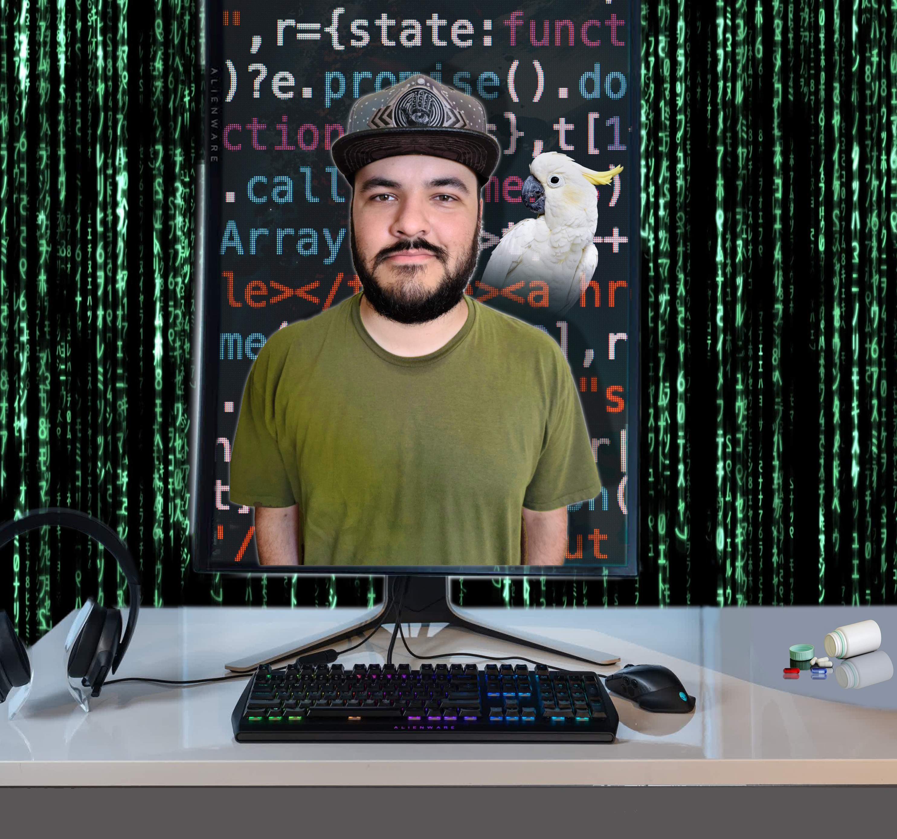
I recently watched the last Matrix movie, number 4 and I thought it was super interesting. I love the story and concept of The Matrix and it's rebels. When I was younger I would have picked the red pill in a heartbeat, or so I think. Now that I am older, a happy life with purpose is what I am aiming for and thus I don't mind the blue pill. As long as the robots are being good to me-What is there to complain about? LOL
I had to make a movie poster for my Photoshop class final. I quickly gravitated towards The Matrix and made a faux movie poster for The Matrix 5, Reincarnation. I really like the tagline I invented, "A new generation." I went all out creating a cool computer screen with html code on it and my boyfriend popping out of the bottom with a materializing cockatoo on his shoulder. Everything has a digital flare that goes along with The Matrix's theme. I also learned how to use gradients and change a regular portrait picture into something cool. I added a pill bottle with the red and blue pill near a VR headset- because we all know The Metaverse is going to be a lot like The Matrix, hehehe...For good or for worse.
I read an article online that made me feel a bit better about the future. The article talked about how people with disabilities and/or illnesses could benefit a lot from an online world where they can customize their avatar and then go to places like virtual museums or homes or planets. That's how they can do things like able bodies can. Everyone deserves a way to interact with other people. Human beings need friends and a community. Maybe some people will befriend robots too, as long as it's not hurting anyone then I think The Metaverse could be benevolent. Hopefully some people will prefer the real world and keep fighting to keep it as green and as healthy as possible...Without the Earth, we can't live or have a lifestyle.
My professor liked my first movie poster version but he thought that I could put my talent to good use and watch a few more online tutorials on how to make a classic The Matrix style poster. He was right. I can do something more Hollywood poster-ish. I am happy that he kindly pushed me in the right direction. Both posters were fun to work on.
Tuesday, July 19, 2022
I can make it rain in the city
I learned how to make rain and animate it as a GIF.
Animated rain tutorial demonstrates how to achieve this in Photoshop. I just followed the instructions. I did decide to add my own unique detail though. I painted realistic clouds in my image to enhance the moody scenery.
Thursday, July 14, 2022
Lesson 7 Magazine cover design result
Lesson 7 in the Adobe Photoshop CC Classroom in a book was super informative, it was all about fonts, and clipping masks to alter the visuals on them.
I got to design a mock magazine cover. It was really cool designing the font styles and adding text to a warped path that made the text curve.
Assignment 4 has a fantasy flare to it
For my 4th assignment project I decided to edit a lady with glasses reading a book. Who knows what the book is about...But I imagined it as being a fantastic story that transports the reader into a magical world. The clouds symbolize that the reader is in another world in her mind. The two cherubs make the scene soft and ethereal along with other details.
Wednesday, July 13, 2022
Using Photoshop masks to edit a lady's photo
Lesson 6 in the Adobe Photoshop CC Classroom in a book was super interesting.
I took an ordinary photo of a lady and tweaked it by using Photoshop masks and channels. I transformed a regular photo into something kind of cool and paired it with a vibrant background.
Tuesday, July 12, 2022
First interesting assignment in college
Lesson 2 in the Adobe Photoshop CC Classroom in a book had some really cool lessons to learn. I had to retouch, restore and make the picture more vivid in Photoshop.
First I used the Crop tool to straighten, trim, and scale the photograph. By default, cropping deletes cropped pixels. Next I used Curves and Levels adjustment layers to remove the color cast and adjust the color and tone in the image. After I selected The Spot Healing Brush tool. It quickly removes blemishes and other imperfections. It also samples pixels around the retouched area and matches the texture, lighting, transparency, and shading of the sampled pixels to the pixels being healed. Then I used the Patch tool to remove unwanted elements from an image. I used a content-aware patch to remove an unrelated person from the right side of the photo. In Content-Aware mode, the Patch tool creates nearly seamless blending with the nearby content. And finally I utilized The Clone Stamp tool. It uses pixels from one area of an image to replace the pixels in another part of the image. Using this tool, you can not only remove unwanted objects from your images, but you can also fill in missing areas in photographs you scan from damaged originals.